Audimation Services has been acquired by Caseware International Learn More.

X
Icon


Preparing Data for Visualization

Tech Tip Provides Guidance for using Discover & Visualization


A picture is worth a thousand…you know the rest. Images, our shared visual language, can convey information across cultural and national boundaries in an instant. Charts and graphs are the shared visual language of business.

IDEA’s Discover and Visualization tools let you take advantage of that shared visual language, letting you turn thousands of detailed line items into meaningful charts and graphs.

While the tools are very easy to use, you may need to prepare the data to produce more complex graphs or charts. For example, suppose you have an IDEA database with this year’s sales in it and you have the same file but with last year’s sales in it. Same fields, different years. You can easily append the files and see how sales are doing over time using the line chart in Visualization. You’ll get something like this.

Straight Line Sales Trend by Month
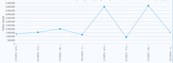
Figure 1 – Straight Line Sales Trend by Month

But a “this month over the same time last year” representation of the same data might tell a more meaningful story to a sales or marketing executive. Something like this.

Sales by Month, Current Year vs Previous Year
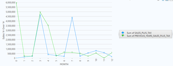
Figure 2 – Sales by Month, Current Year vs Previous Year


How to Create a Multi-Series Chart:


Create Multi-Series Chart Dialog Box

  1. Create a grouping field.
    1. The IDEA database files used in this example had no way to group the data by month. A field was appended to each file titled, “Month.”
    2. This equation was used to create the data in the field:
      1. @month( INV_DATE )
  2. Join the files
    1. The two files were joined using the newly created “Month” field as the match field.
  3. Rename the previous year’s sales amounts to make identification easier
    1. The “SALES_PLUS_TAX” field for the prior year was renamed to “PREVIOUS_YEARS_SALES_PLUS_TAX”.
  4. Open Visualization
  5. Create a new dashboard
  6. Create a line chart using these criteria:
    1. Chart type: Line Chart
    2. Database: the joined result set
    3. Group by: the newly created “Month” field
      1. Leave “Stratify” and “Exclude zeros/errors/blanks” blank
    4. Statistic: Sum
    5. Field to Sum:
      1. Fields to sum are the Y-series fields
      2. You can select up to five fields (series)
        1. In this example, the fields SALES_PLUS_TAX and PREVIOUS_YEARS_SALES_PLUS_TAX (the renamed field) were selected
    6. Chart Caption: Title the chart as desired
    7. X-axis Title:  “Month” was used in this example
    8. Y-axis Title:  “Sales Yr over Yr” was used in this example
    9. Show Legend: This was checked to show what data was displayed in each line color
      1. This is the result: Line Chart Data Legend
  7. Click Save


If you have questions about this or other IDEA functions, please contact our help desk:
888-641-2800 Option 4
[email protected]


CaseWare IDEA , Tech Tip


Posted By

By Team Audimation


Related Posts
Tired of Wrangling Cumbersome Client Data?
Jan 24 Have you ever wrangled a file and felt like it won? We will give you 10 (really compelling) reasons to try our data importing services, which save you time, eff...
Take a Lean Six Sigma Approach Using Data Analytics
Oct 16 Henry Ford once said that if he had asked people what they wanted, they would have said faster horses. Constant innovation keeps businesses thriving. Regar...
No Image
Sep 07 Healthcare providers, including hospitals and physician groups, must effectively manage a broad network of direct and indirect contractual agreements. If perfor...
BROWSER NOT SUPPORTED

This website has been designed for modern browsers. Please update. Update my browser now

×