Tech Tip Provides Guidance for using Discover & Visualization
A picture is worth a thousand…you know the rest. Images, our shared visual language, can convey information across cultural and national boundaries in an instant. Charts and graphs are the shared visual language of business.
IDEA’s Discover and Visualization tools let you take advantage of that shared visual language, letting you turn thousands of detailed line items into meaningful charts and graphs.
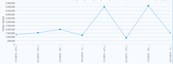
While the tools are very easy to use, you may need to prepare the data to produce more complex graphs or charts. For example, suppose you have an IDEA database with this year’s sales in it and you have the same file but with last year’s sales in it. Same fields, different years. You can easily append the files and see how sales are doing over time using the line chart in Visualization. You’ll get something like this.
Figure 1 – Straight Line Sales Trend by Month
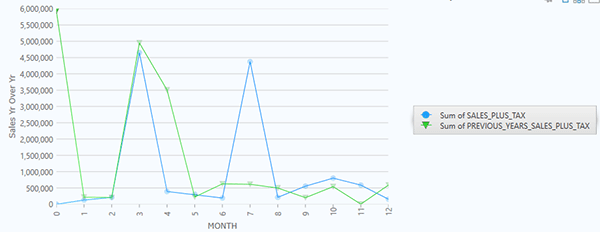
But a “this month over the same time last year” representation of the same data might tell a more meaningful story to a sales or marketing executive. Something like this.
Figure 2 – Sales by Month, Current Year vs Previous Year
How to Create a Multi-Series Chart:
Create a grouping field.
The IDEA database files used in this example had no way to group the data by month. A field was appended to each file titled, “Month.”
This equation was used to create the data in the field:
@month( INV_DATE )
Join the files
The two files were joined using the newly created “Month” field as the match field.
Rename the previous year’s sales amounts to make identification easier
The “SALES_PLUS_TAX” field for the prior year was renamed to “PREVIOUS_YEARS_SALES_PLUS_TAX”.
Open Visualization
Create a new dashboard
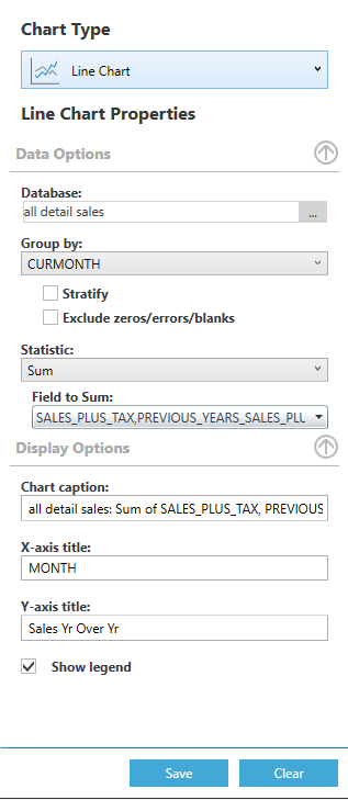
Create a line chart using these criteria:
Chart type: Line Chart
Database: the joined result set
Group by: the newly created “Month” field
Leave “Stratify” and “Exclude zeros/errors/blanks” blank
Statistic: Sum
Field to Sum:
Fields to sum are the Y-series fields
You can select up to five fields (series)
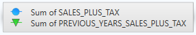
In this example, the fields SALES_PLUS_TAX and PREVIOUS_YEARS_SALES_PLUS_TAX (the renamed field) were selected
Chart Caption: Title the chart as desired
X-axis Title: “Month” was used in this example
Y-axis Title: “Sales Yr over Yr” was used in this example
Show Legend: This was checked to show what data was displayed in each line color
This is the result:
Click Save
If you have questions about this or other IDEA functions, please contact our help desk: 888-641-2800 Option 4 [email protected]
Jul 20 Where to Look and How to Find Them Fraud is on the rise. And if you don’t know what fraud looks like, you’re not likely to find it. While most oc...
Jul 20 By Donald E. Sparks, CRMA, CIA, CISA, ARM There’s no shortage of news stories about fraud. From Rita Crundwell who misappropriated more than $53 millio...
Oct 01 Attracting and retaining clients is essential to the success of any external auditor or consultant. It’s also one of the profession’s top challenges...
BROWSER NOT SUPPORTED
This website has been designed for modern browsers. Please update. Update my browser now