Audimation Services has been acquired by Caseware International Learn More.

Visualization allows us to explain complex data and make connections that would otherwise remain unknown. The new functionality of IDEA 10 gives you the ability to navigate your data with confidence, and share your results in more meaningful ways.
At the last IDEA User Conference, James Loughlin with AuditWare Systems was invited to share his thoughts on the benefits of incorporating data visualization into your audit work including:

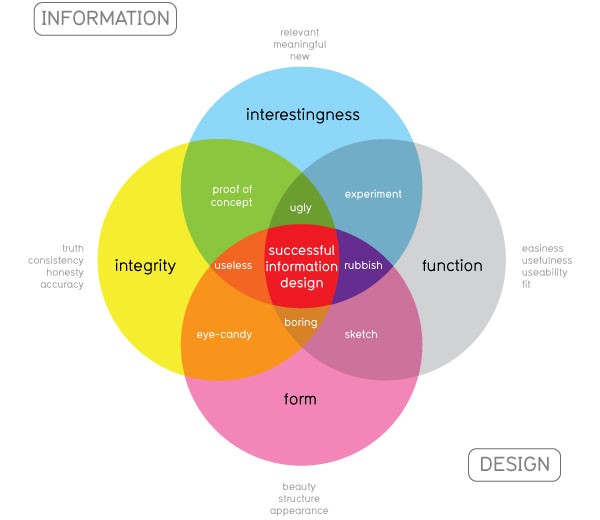
Visual expert David McCandless has developed an infographic to explain the benefits of merging information and design, including the elements that make data visualization work well together.
Two core benefits of data visualization are delivering insights to understand what is transpiring within the business, and putting large amounts of data into context with minimal effort. It allows you to:
When considering using data visualization in your audit work, think about the speed of access to information that’s available. Can you make your point as quickly and with the same level of confidence as you would with rows and columns of data?
Loughlin shared his experience working with a city council client in the UK that wanted to embed analytics within their audit function. They used Excel, but wanted to take their work a step further. Decision-makers wanted assurance that it was worth the investment, including proof of issues and estimated recoveries – information that can only be gathered during a proof of concept.
The auditors split the data into two parts: master data and transactional data. Here are some of the KPIs they used:

Column graphs were used to show the total amount of records and a split line record was used to show where there were issues. Management was quickly able to see areas where potential cost savings were missed, including amounts. Active duplicate vendors within the system revealed high levels of risk where invoices posted against two different variations of the same supplier could result in duplicate payments.
They were able to show multiple instances where employees with high pay grades were posting information into the system – tasks that should be performed by administrative staff. By using data visualization, the auditors were able to show the costs associated with this inefficient process.
In some instances, vendors offer incentives to pay invoices within a specified timeframe. Graphs were used to whether invoices were being paid in a timely manner, before or after deadlines and the calculated potential cost savings for taking advantage of vendor payment agreements.
IDEAScripts were used to integrate analytics with Tableau’s geo plotting feature to map supplier data and expenses. This tactic was particularly useful when the city council was required to contract work with locally-owned businesses. It was also used to track project costs and progress and report findings to management.
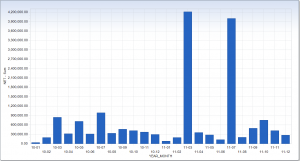
Standard Visualization – Bring in data from multiple years to compare information and track trends such as sales by location, vendor payments, etc. Look for spikes in the data, then drill down to find out their root cause. Analyze data year-to-year to find the “norm.” Simply use the “Chart” button in the IDEA Ribbon to get started.

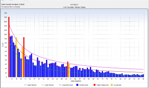
Statistical Visualization – The Benford’s Law feature within IDEA can be highly effective for evaluating what the starting values are that one might expect to see within the data. Drill down into repeating values to spot trends. Summarize data by supplier or product to determine if there are issues. Benford’s Law can also be used to generate a random sample.
Trend Analysis – Based on linear regression, it gives you the ability to track trends and detect patterns across multiple data sets.
Time Series – Differs from trend analysis by looking at historical information to predict expected levels. It provides indicators of issues, including instances where levels drop above or below an expected amount.
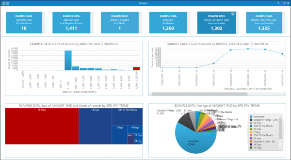
Discover – This new feature of IDEA automatically populates the IDEA Visual Dashboard with charts and field statistics to graphically view trends, patterns and outliers. Captions detailing the database and the analysis performed accompany each chart automatically. It allows you to quickly capture anomalies and visually profile databases within just a few seconds.

While you may be skeptical of trusting an automated system to analyze available data, visualization gives you the tools you need to become familiar with the data and then determine what deserves investigation. Think of Visualization as a sandbox where you can play with or analyze the data using a suite of tasks and file management features.
As you explore any suspicious data you find, IDEA will generate visuals in the form of charts and field statistics, showing exceptions and suspicious transactions that are easily overlooked in a spreadsheet. You can add the visuals into a dashboard to help you interpret the information, and then modify it to display what is most relevant to you and key stakeholders – and get to the point much faster!
IDEA offers some helpful guides and sample data to build your confidence in using these new features. And as always, the IDEA Help Desk is available to assist you in using any of these new capabilities.
Information for this article was sourced from a presentation given by James Loughlin with AuditWare Systems, the UK-based distributor of IDEA.
This website has been designed for modern browsers. Please update. Update my browser now